the importance of color

Color in Tech
Color is known to have a powerful psychological impact on our mood, behavior and decisions. From the well documented peaceful tranquil blues to uplifting and energizing yellows, we subliminally relate different shades of the color wheel to different emotions.
In the world of tech products and their accessories, traditionally they’ve been associated with black, silver, or white which isn’t a coincidence. Black often conveys power and performance, whereas silver and white communicate innovation and modernity.
However, over recent years there’s been a transition into celebrating tech with color, each year the big tech brands have been veering away from tradition, with soft tonal colors or brighter, expressive devices, like the latest iMacs or the Samsung Galaxy S21 range.

As tech products become more engrained in our everyday life, expressing your personality through your choice of tech and its colour has become more important. Research has found that typically, people decide whether they like a product or not in under 90 seconds, with 90% of that decision solely based on colour. That’s why at atom we take our time when choosing the shades, tones, and hues of our products. Sometimes painstakingly so – to make sure we strike the balance of expressing your style and complementing the device you are accessorising.
Colour matching accessories to devices, especially phone cases to phones can be challenging to execute, with Apple famously keeping their cards close to their chest with new colour announcements. That’s why we are so pleased with the latest iPhone 13 phone colours and how well they match to our cases.
Which colour case should I choose for each phone?
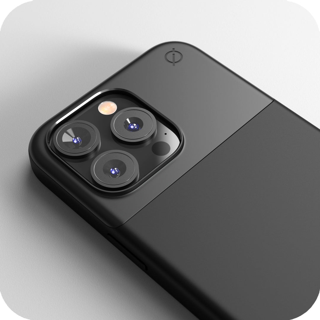
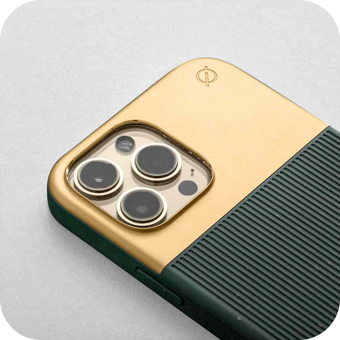
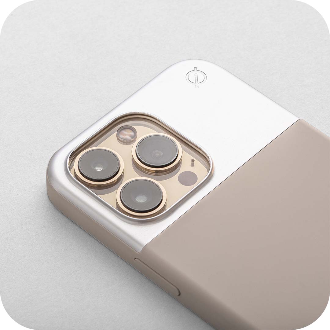
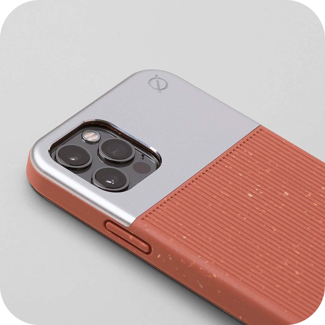
Our latest collection of iPhone 13 cases compliment the colours of the new iPhone 13’s perfectly, with a selection of cases which seamlessly colour match and others to contrast. These are the combinations that we recommend:

Graphite: a strong, dark grey-black replacing the Space Grey of former years. It goes with everything and doesn't distract from your personal style - pairs perfectly with split wood fibre in carbon.
Gold: a soft champagne coloured glass back with vibrant gold-coloured edges –flawlessly colour matches with our stone coloured split silicone.
Silver: with a frosted white back and silver-coloured edges this is the lightest and brightest of the Pro devices – this contrasts well with split wood fibre in ink blue.
Sierra Blue: a brand new colour for 2021, a light ice blue with multifaceted tones to alter in different lights, with polished stainless steel sides - pairs perfectly split silicone in ink blue.

Starlight: another new shade, starlight is a warm softer shade of white – pairs perfectly with split silicone in stone.
Midnight: nearly black with a hint of dark blue – the perfect match for split wood fibre in carbon.
Blue: a brighter version of the 2020 pacific blue – pairs perfectly with our ink blue split silicone.
Pink: pastel without being childish, this pink is delicate like ballet slippers – a great colour match with our pink clay split silicone.
(PRODUCT)RED: A bold fiery red linked to the charity (PRODUCT)RED, with a portion of the proceeds from each purchase going to the Global Fund to fight AIDS and the Global Fund’s COVID19 Response. We recommend split wood fibre in carbon for a strong contrast.


